Our latest breif for Digital Imaging was to create a stop motion animation.
This is mine.
It was so annoying to make but I think if I ever have enough time and patience I'll try and make another one.
Monday, October 25, 2010
Saturday, October 2, 2010
MUTANT ANIMAL
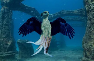
We had to create some sort of mutant animal thing in Digital Imaging. We needed to use layer masks to put parts of one animal onto another.
I used a Meerkat, Leopard skin, Octopus tentacles and Eagle wings.
I call it, the Meagle. Nah, I don't. I still have to think of a good name for it but I'll use that for now.
I used a Meerkat, Leopard skin, Octopus tentacles and Eagle wings.
I call it, the Meagle. Nah, I don't. I still have to think of a good name for it but I'll use that for now.
Labels:
eagle,
leopard,
meerkat,
mutant animal,
octopus,
photoshop,
underwater
Friday, October 1, 2010
HORROR DVD COVER
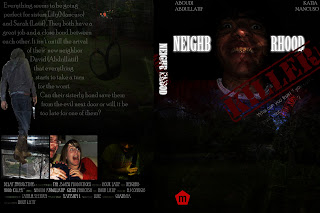
For an assignment in Digital Imaging class we had to create our own horror dvd cover. We watched some tutorial videos in class, I used them to help me create the layout of my dvd cover and for other basic tips.
At first I was going to get some stock images off DeviantArt to use but then I decided to go out and take my own pictures. That made it easier to wrok with, that way I could have a concistant theme through out my cover. I did use a texture stock from DeviantART
Although this is something I should have already known and done (well I did, but I didn't think it would really matter) I didn't save at any point while making my dvd cover, and after like 3 hours of doing it photoshop closed! aslkrjfsdkhskfsk I was about to cry because I just finished the front an spine and was up to doing the back. I had my screen dumps and I just copied what I did from there and saved every two seconds!
This is my dvd cover

Labels:
assignment,
deviantART,
dvd cover,
glass,
horror,
photoshop,
school
Sunday, May 23, 2010
Invitations.
So for our new Digital Imaging assignment we had to create the invitations for our upcoming exhibition.
It needed to reflect what we've done so far like sculpting, fashion, jewelery making and other things. Not sure if mine reflects it very well.. I tried to get the feel of the different styles people in our class have rather then what we've learnt.
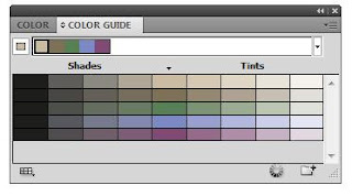
This is the colour pallet that I'm using in my invitations.
It reflects the type of art we've been doing, like the deep sea creature sculpture and the charcoal mannequin drawings we did.
It also reflects the people in the course, not saying they're all emo/goth, but they're cool and natural..
It also reflects the people in the course, not saying they're all emo/goth, but they're cool and natural..
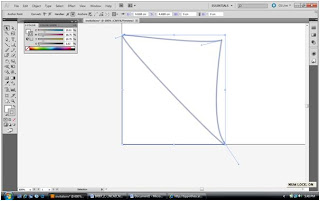
I wanted a little fold on the side of the invitations because our exhibtion is called "paper scissors rock" so I wanted this to symbolize the paper.
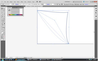
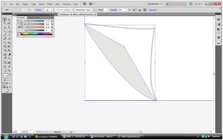
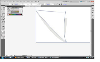 I made shadows under it to make it look life like.
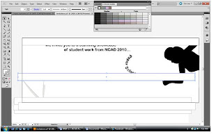 I made a rectangle and copied it a billion times
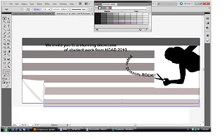
I colored it the different colours I wanted.
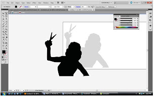 I retraced the image of the girl so I could have her ontop of the colour.
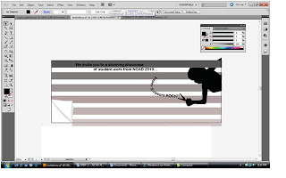
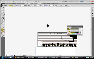 I made a skull with the pen tool and layerd it down the bottom.
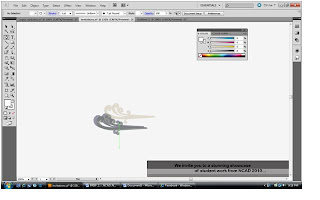
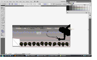

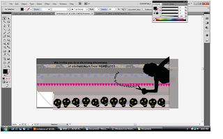 And did the same with other patterns.
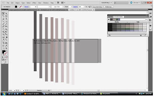 For the back I did the same thing I did on the front with the rectangles.
Sunday, May 9, 2010
Pencil to Illustrator.
For an assignment in Digital Imaging we had to draw a picture and then retrace the whole thing on Illustrator.It was pretty stressfull and hard but also fun and exciting to learn new things.
This was the picture I drew.
I didn't realise how hard it would be when I drew it.(Model Lily Cole - Cover of Times Magazine)
I started by making the base layer of her.

 Then added all the the major highlights in her face.
 I did the highlights iin her hair.

Then I details in the face...
This was the picture I drew.
I didn't realise how hard it would be when I drew it.(Model Lily Cole - Cover of Times Magazine)
I started by making the base layer of her.
Then I details in the face...
Subscribe to:
Comments (Atom)
