So for our new Digital Imaging assignment we had to create the invitations for our upcoming exhibition.
It needed to reflect what we've done so far like sculpting, fashion, jewelery making and other things. Not sure if mine reflects it very well.. I tried to get the feel of the different styles people in our class have rather then what we've learnt.
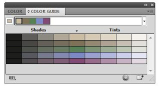
This is the colour pallet that I'm using in my invitations.
It reflects the type of art we've been doing, like the deep sea creature sculpture and the charcoal mannequin drawings we did.
It also reflects the people in the course, not saying they're all emo/goth, but they're cool and natural..
It also reflects the people in the course, not saying they're all emo/goth, but they're cool and natural..
I wanted a little fold on the side of the invitations because our exhibtion is called "paper scissors rock" so I wanted this to symbolize the paper.
 I made shadows under it to make it look life like.
 I made a rectangle and copied it a billion times
I colored it the different colours I wanted.
 I retraced the image of the girl so I could have her ontop of the colour.
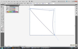
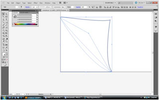
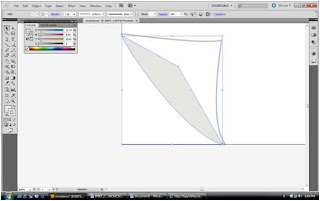
 I made a skull with the pen tool and layerd it down the bottom.

 And did the same with other patterns.
 For the back I did the same thing I did on the front with the rectangles.
 And then added all the nessisary information on the back and made a clipping mask to get rid of the sides.
No comments:
Post a Comment